
MICROSOFT SMART SEARCH
Making ‘search’ feel delightful
Overview
Microsoft wanted to have one search functionality that combined results from a user’s local machine and Web results. I created a UX framework and visual design system that seamlessly gave users easy access to the information they are looking for.
Role
UX Designer
responsibilities
UX framework and visual design
collaborators
UX team, product managers, engineering teams across Bing and Windows
impact
Shipped the ‘Smart Search’ feature as part of Windows 8.1
The project
Customer problems
As a user, I want to find what I need faster. I also want to discover new content that piques my interest.
Business problems
Microsoft wanted to showcase Bing’s search capabilities and integrate it into Windows search.
Approach
Define design principles
Design for our Medium
Optimize for touch and leverage the system’s natural affordances.
Clean and open layout
Minimize distraction and help people get immersed in the content.
Scale beautifully
Create a great experience on every form factor and viewing option.
Invest in a great tile
Pursue a clear information hierarchy with the use of tiles and typography.
Framework explorations
I worked with designers across Bing and Windows to explore framework models that followed Windows 8 UX principles. My work explored:
- Content density / thresholds
- Modern Windows UX / Modern Bing UX alignment
- Scalability across scenarios
- App exposure / promotions
- Web "answers" embedded in the search results
- Local (device) result content integration

User scenarios
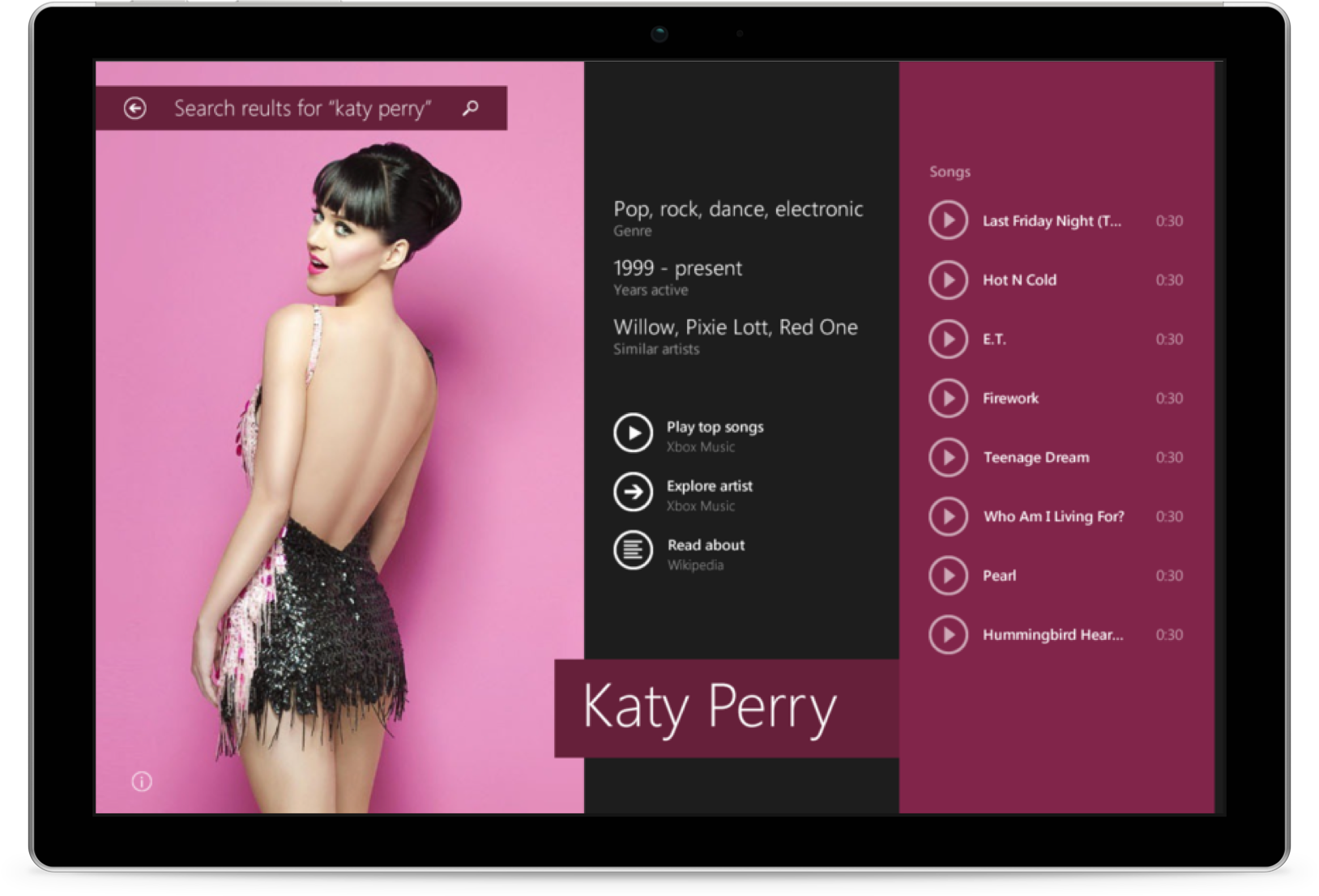
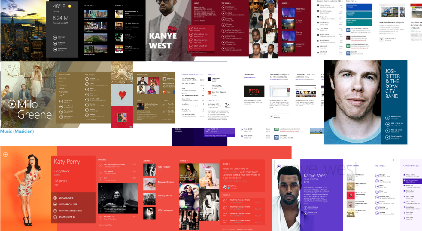
After we had a high-level direction for the structure, I explored how different scenarios stress-tested this structure, focusing specifically on queries that involved place-entities (e.g. "I want to quickly find more information about a city.") and athlete-entities (e.g. "I want to quickly understand who Julius Peppers is"). As at team, we did many visual explorations on how we might make search feel more "human" and "curated."
Responsive design
We needed the story collection to "live" on Amazon.com and abide by the site's guidelines. At the same time, we needed our product to feel editorially curated, not algorithmically generated. I experimented with custom, full-bleed artwork to give it an editorial feel. I also experimented with the shape of each story cover. Instead of a the iconic "tall rectangle," could we lean into the podcast metaphor, which are typically square?
Dynamic modules
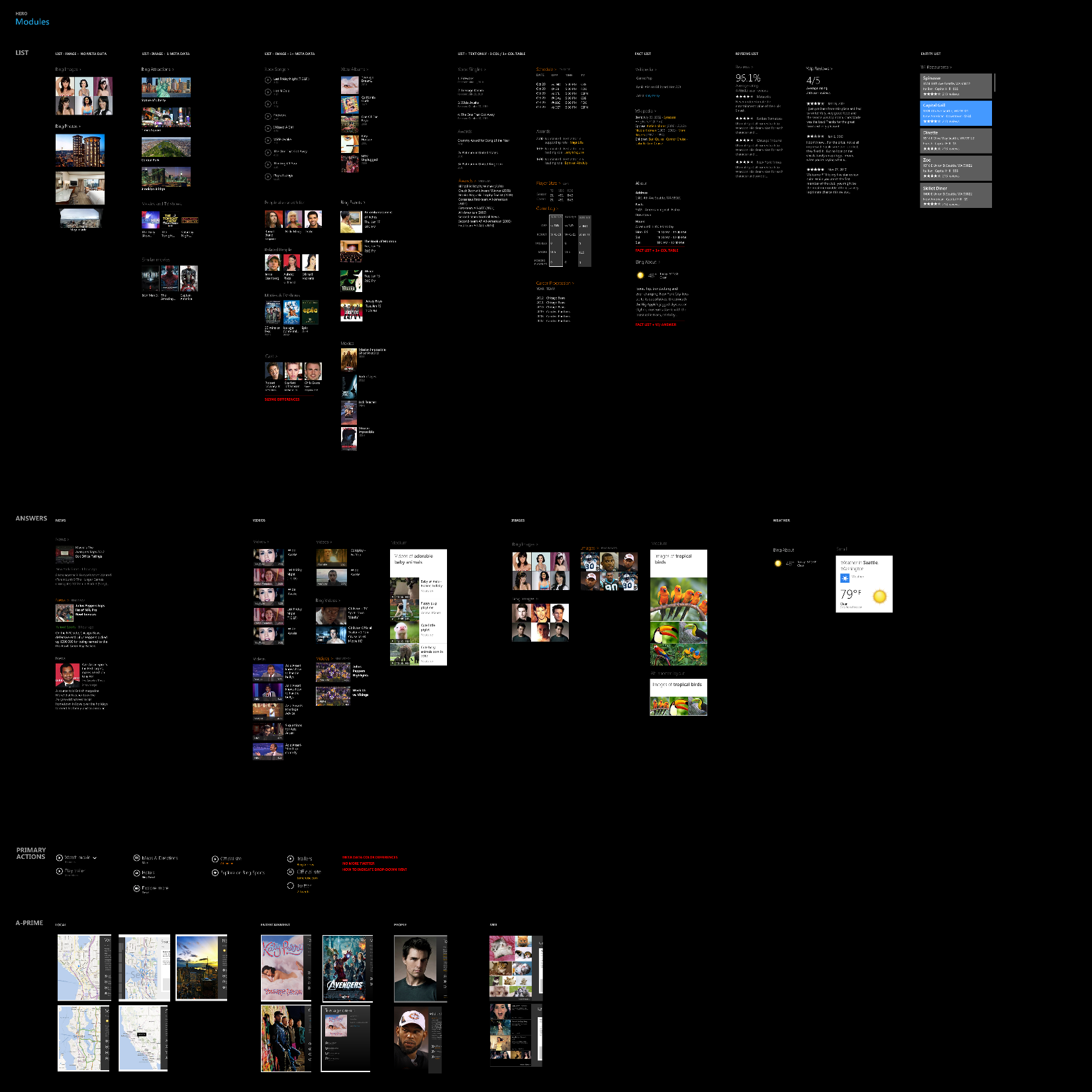
We needed to consider and design for various "modules," depending on the type of content or information being shown. For example, an entity could be directly tied to movies, songs, images, news, twitter quotes, or information factoids.
The solution
MICROSOFT SMART SEARCH
Making ‘search’ feel delightful
Overview
Microsoft wanted to have one search functionality that combined results from a user’s local machine and Web results. I created a UX framework and visual design system that seamlessly gave users easy access to the information they are looking for.
Role
UX Designer
responsibilities
UX framework and visual design
collaborators
UX team, product managers, engineering teams across Bing and Windows
impact
Shipped the ‘Smart Search’ feature as part of Windows 8.1
The project
Customer problems
As a user, I want to find what I need faster. I also want to discover new content that piques my interest.
Business problems
Microsoft wanted to showcase Bing’s search capabilities and integrate it into Windows search.
Approach
Define design principles
Design for our Medium
Optimize for touch and leverage the system’s natural affordances.
Clean and open layout
Minimize distraction and help people get immersed in the content.
Scale beautifully
Create a great experience on every form factor and viewing option.
Invest in a great tile
Pursue a clear information hierarchy with the use of tiles and typography.
Framework explorations
I worked with designers across Bing and Windows to explore framework models that followed Windows 8 UX principles. My work explored:
- Content density / thresholds
- Modern Windows UX / Modern Bing UX alignment
- Scalability across scenarios
- App exposure / promotions
- Web "answers" embedded in the search results
- Local (device) result content integration
User scenarios
After we had a high-level direction for the structure, I explored how different scenarios stress-tested this structure, focusing specifically on queries that involved place-entities (e.g. "I want to quickly find more information about a city.") and athlete-entities (e.g. "I want to quickly understand who Julius Peppers is"). As at team, we did many visual explorations on how we might make search feel more "human" and "curated."
Responsive design
We needed the story collection to "live" on Amazon.com and abide by the site's guidelines. At the same time, we needed our product to feel editorially curated, not algorithmically generated. I experimented with custom, full-bleed artwork to give it an editorial feel. I also experimented with the shape of each story cover. Instead of a the iconic "tall rectangle," could we lean into the podcast metaphor, which are typically square?
Dynamic modules
We needed to consider and design for various "modules," depending on the type of content or information being shown. For example, an entity could be directly tied to movies, songs, images, news, twitter quotes, or information factoids.
The solution
MICROSOFT SMART SEARCH
Making ‘search’ feel delightful
Overview
Microsoft wanted to have one search functionality that combined results from a user’s local machine and Web results. I created a UX framework and visual design system that seamlessly gave users easy access to the information they are looking for.
Role
UX Designer
responsibilities
UX framework and visual design
collaborators
UX team, product managers, engineering teams across Bing and Windows
impact
Shipped the ‘Smart Search’ feature as part of Windows 8.1
The project
Customer problems
As a user, I want to find what I need faster. I also want to discover new content that piques my interest.
Business problems
Microsoft wanted to showcase Bing’s search capabilities and integrate it into Windows search.
Approach
Define design principles
Design for our Medium
Optimize for touch and leverage the system’s natural affordances.
Clean and open layout
Minimize distraction and help people get immersed in the content.
Scale beautifully
Create a great experience on every form factor and viewing option.
Invest in a great tile
Pursue a clear information hierarchy with the use of tiles and typography.
Framework explorations
I worked with designers across Bing and Windows to explore framework models that followed Windows 8 UX principles. My work explored:
- Content density / thresholds
- Modern Windows UX / Modern Bing UX alignment
- Scalability across scenarios
- App exposure / promotions
- Web "answers" embedded in the search results
- Local (device) result content integration
User scenarios
After we had a high-level direction for the structure, I explored how different scenarios stress-tested this structure, focusing specifically on queries that involved place-entities (e.g. "I want to quickly find more information about a city.") and athlete-entities (e.g. "I want to quickly understand who Julius Peppers is"). As at team, we did many visual explorations on how we might make search feel more "human" and "curated."
Responsive design
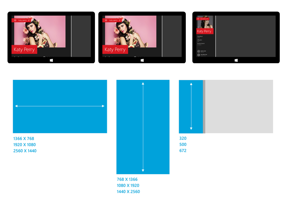
Windows 8.1 gave users the ability to "snap" app-windows to different sizes for multi-tasking. Additionally, users could be viewing Smart Search on any PC device, which meant there would be variations on display sizes. We needed to ensure that our designs worked from small screens to very large screens.
Dynamic modules
We needed to consider and design for various "modules," depending on the type of content or information being shown. For example, an entity could be directly tied to movies, songs, images, news, twitter quotes, or information factoids.
The solution